Mathematics
STATISTICS
Reading settings
Text size
Line spacing
Colours
STATISTICS
In this topic (Statistics), students will study how to collect, organize, present, analyze, and interpret data in meaningful ways.
Frequency tables
A frequency table is a way of organizing data to show how often each value or category appears. It is a simple method to summarize and display information in a clear and organized way.
Identify procedure of constructing frequency table
This video introduces the concept of building a frequency table. using tally
Activity 1
Read the following information
- Collect the Data: Gather all the raw data you want to organize. Example: Ages of 12 students – 12, 13, 12, 14, 12, 13, 14, 15, 13, 12, 14
- Make a table with three columns with a data, tally and frequency
- Write a data set in first column
- Count a number of times each item representing in tally
- Write frequency in third column
- Write a total frequency in last row of the table
Draw frequency table
Samples of frequency table
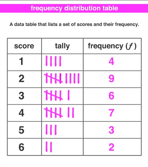
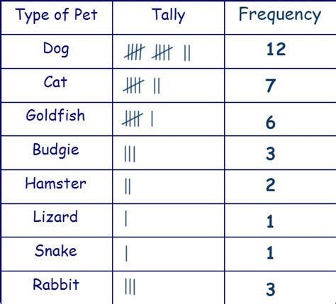
Exercise 1
- 1. A fruit seller recorded the number of bananas sold each day: 5, 6, 5, 7, 6, 5, 8, 7, 6, 5. Construct a frequency table with tally marks.
- 2. The number of buses a student used in 10 days: 2, 1, 2, 3, 2, 1, 2, 3, 1, 2. Organize the data into a frequency table.
- 3. The number of hours students studied in the evening: 1, 2, 1, 3, 2, 2, 1, 4, 3, 2. Construct a frequency table using tally marks.
- 4. A person recorded how many cups of water they drank daily: 6, 7, 5, 6, 8, 7, 6, 5, 7, 6. Form a frequency table with tally marks.
- 5. Goals scored by a player in 10 matches: 0, 1, 2, 1, 3, 2, 1, 0, 2, 1. Construct a frequency table.
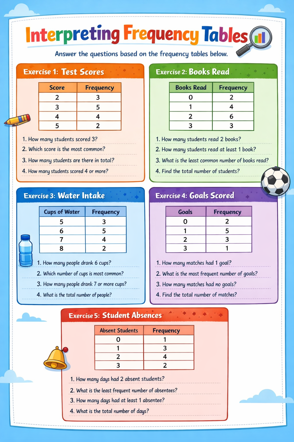
Interpret data from frequency table
Interpretation of data from frequency table
| Fruit | Tally | Frequency |
| Mango | 5 | |
| Banana | 8 | |
| Apple | 3 | |
| Orange | 4 |
- The most popular fruit is Banana (highest frequency = 8).
- The least chosen fruit is Apple (lowest frequency = 3).
- Mango and Orange are in between, showing moderate preference.
Interpretation of data from frequency table
| Food | tally | Frequency |
| Rice | 12 | |
| Beans | 7 | |
| Meat | 10 | |
| Cassava | 6 | |
| Maize | 4 |
- The most popular food is rice (highest frequency = 12).
- The least popular food is maize (lowest frequency = 4).
- Meat is moderately preferred.
| Transport | Tally | Frequency |
| Car | 5 | |
| Bicycle | 10 | |
| Walking | 7 | |
| Bus | 19 |
- Interpretation: Most students go to school by Bus (frequency = 19). ·
- Least common mode is Car (frequency = 5). ·
- Bicycle and Walking are moderately common.
Exercise 2
Histogram
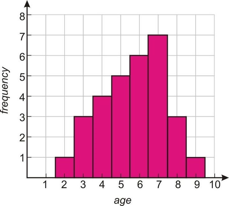
A histogram is a type of bar graph used in statistics to represent the frequency of data. It is usually used for continuous numerical data, such as marks, height, weight, or temperature.
- Key Features of a Histogram
- Bars are drawn adjacent to each other – no gaps between bars, unlike a regular bar chart.
- Width of each bar represents a class interval (range of values).
- Height of each bar represents the frequency of that class.
- It helps to visualize the distribution of data easily.
Identify the procedure of constructing histogram
Procedure for Constructing a Histogram
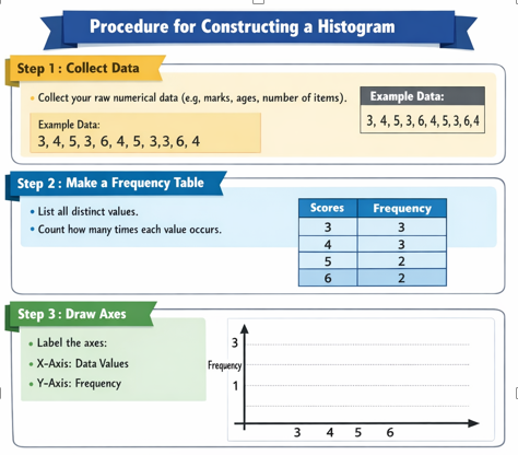
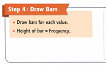
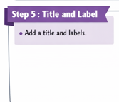
Draw histogram
Activity 2
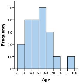
Study the following: Construction of histogram
| Age interval | frequency |
| 20- 29 | 2 |
| 30-39 | 4 |
| 40-49 | 4 |
| 5059 | 5 |
| 60-69 | 3 |
| 70-79 | 1 |
| 80-89 | 0 |
| 90-99 | 1 |
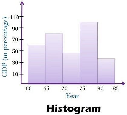
| GPD | Frequency (Year) |
| 60-65 | 60 |
| 65-70 | 80 |
| 70-75 | 50 |
| 75-80 | 100 |
| 80-86 | 40 |
Exercise 3
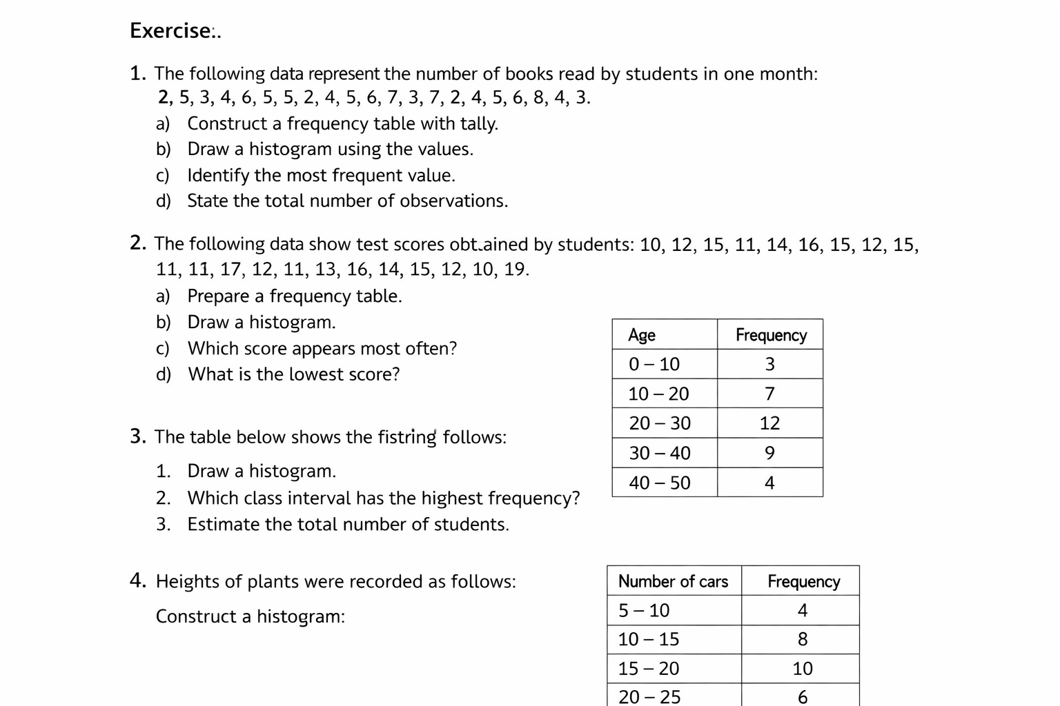
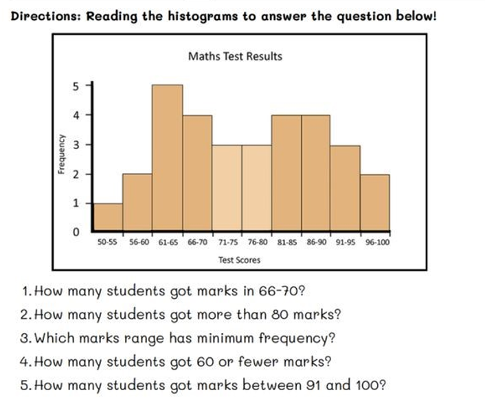
Interpret data from the histogram
Activity 3
Study the following examples and answer the following questions
Line graph
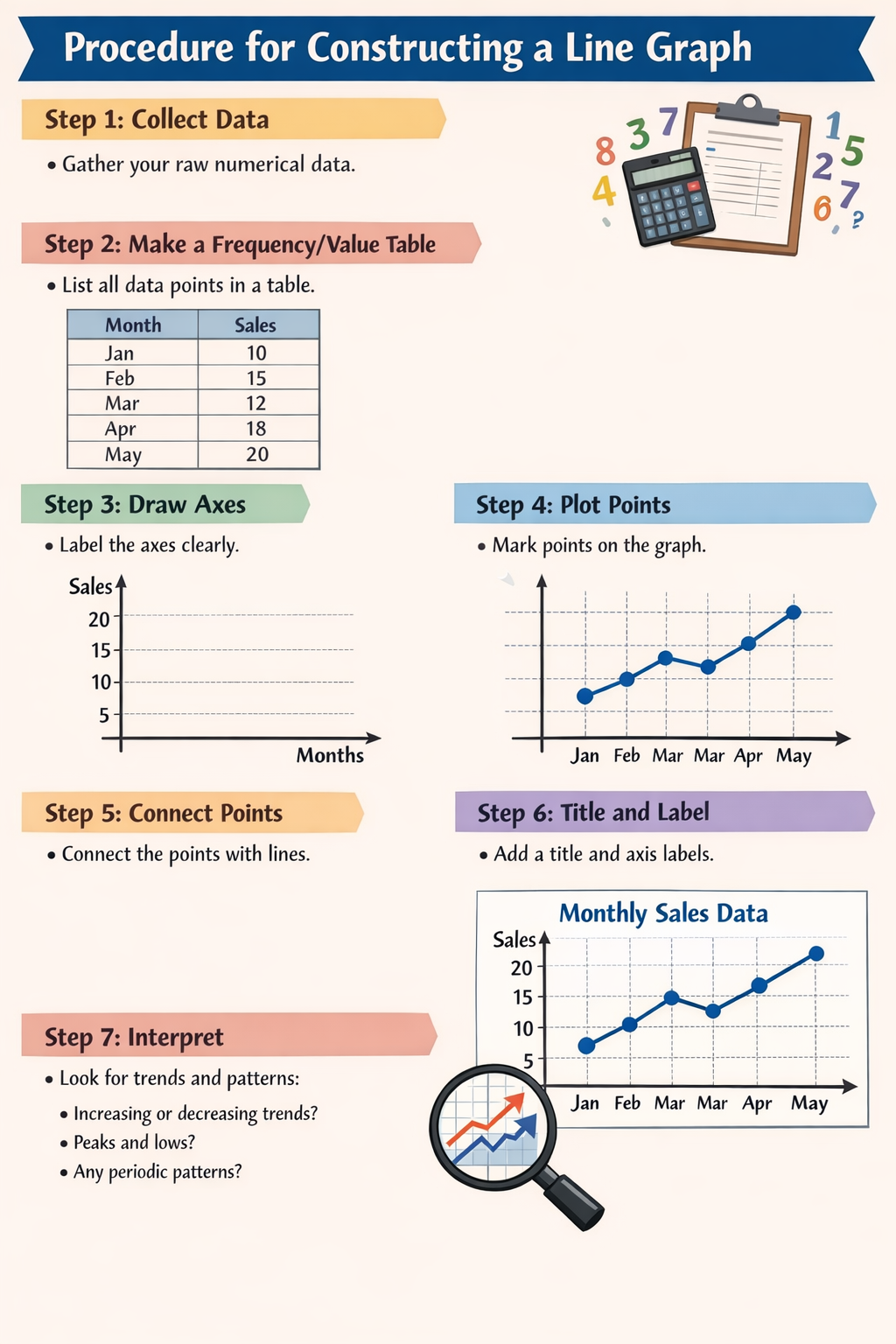
A line graph is a type of graph that uses points connected by straight lines to show how a variable changes over time or in relation to another variable
Identify concept of line graph
Activity 4
Observe the following informationA line graph is a type of graph that uses points connected by straight lines to show how a variable changes over time or in relation to another variable. It is particularly useful for showing trends, patterns, or changes.
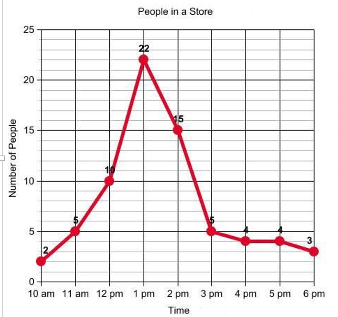
Procedure for Constructing a Line Graph
Construct line graph
Activity 5
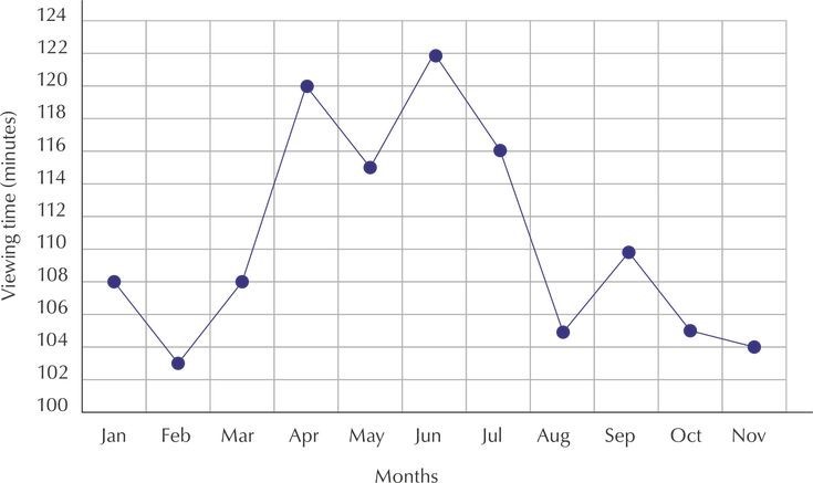
Observe the following line grapgh
| Month | Viewing time (minutes) |
| January | 108 |
| February | 103 |
| March | 108 |
| April | 120 |
| May | 115 |
| June | 122 |
| July | 116 |
| August | `105 |
| September | 109 |
| October | 105 |
| November | 104 |
Exercise 4
Draw the line graph from the following data
| English scores | Frequency |
| 81-85 | 6 |
| 76-80 | 10 |
| 71-75 | 15 |
| 66-70 | 8 |
| 61-65 | 12 |
| Height (cm) | Frequency |
| 160 | 25 |
| 165 | 20 |
| 170 | 15 |
| 175 | 30 |
| 180 | 10 |
Analyze information from the line graph
Activity 6
Study the following information
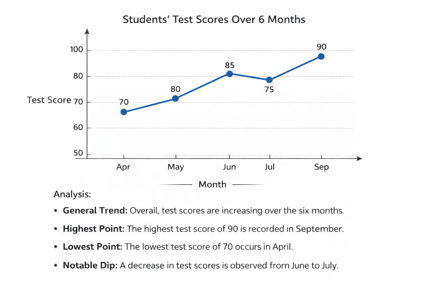
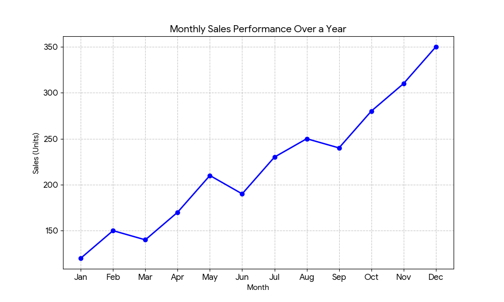
Maximum Sales: The highest sales volume was recorded in December (350 sales), likely due to seasonal demand or end-of-year promotions. Minimum Sales: The lowest sales volume occurred in January (120 sales). Fluctuations: While the general trend is positive, there were minor dips in March, June, and September. However, in each instance, the following month showed a strong recovery that surpassed the previous peak.
Exercise 5
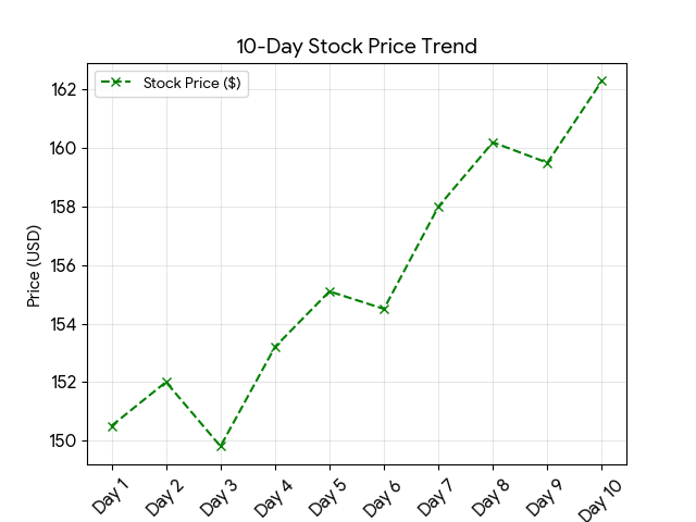
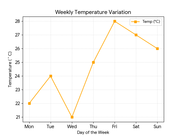
Analyse the following line graphs
Pie chart
A
Identify the concept of pie chart
Activity 7
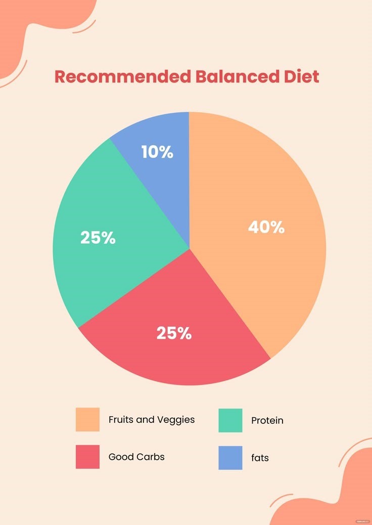
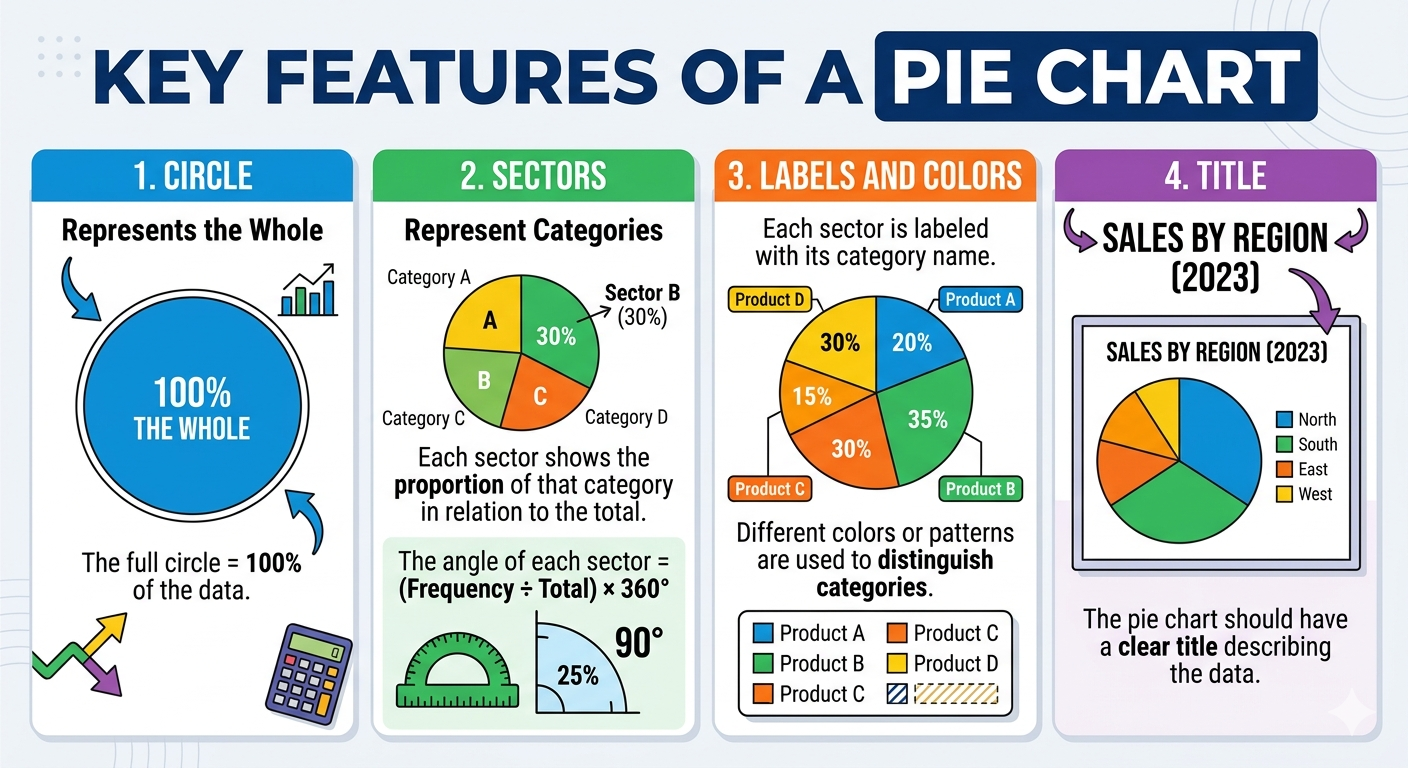
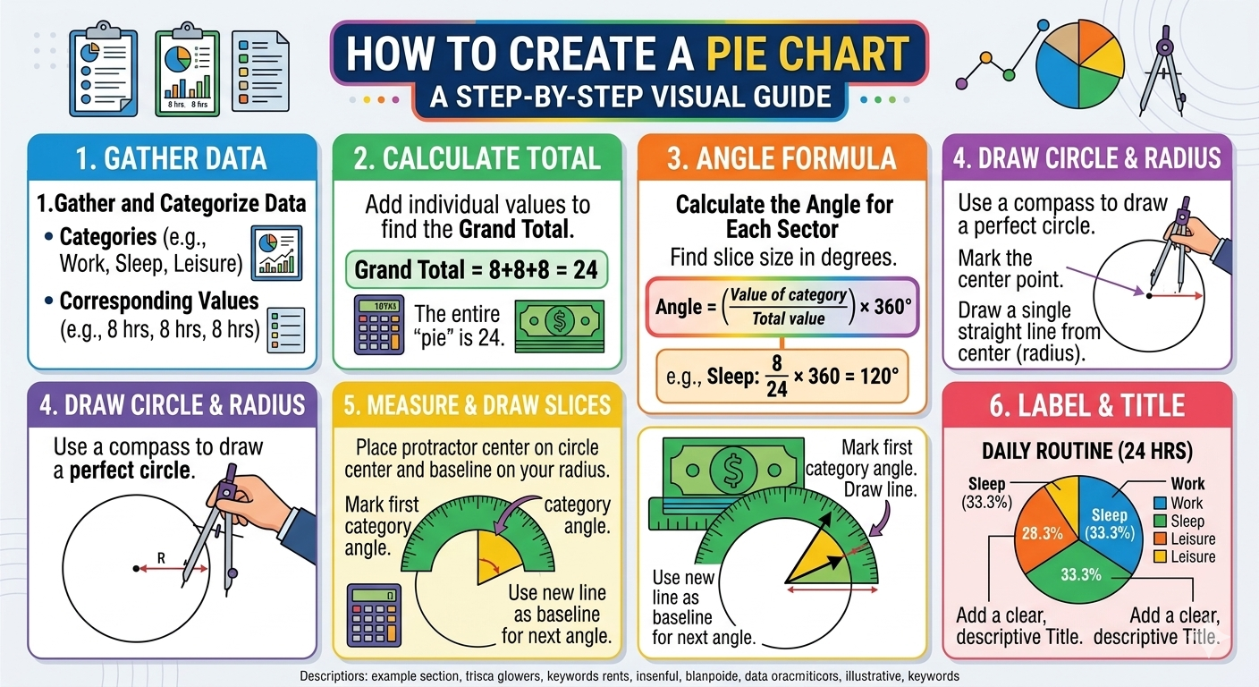
A pie chart is a circular chart divided into sectors (slices), where each sector represents a part of the whole. The size of each sector is proportional to the frequency, percentage, or fraction of that category. Pie charts are often used to show how a total is divided among categories.
Construct pie chart
Procedure to construct a pie chart
Example 1
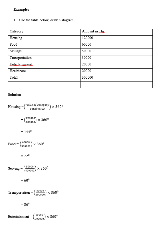
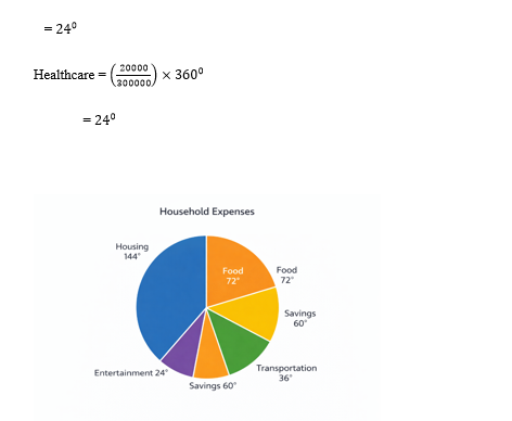
Study the following example
Exercise 6
From each of the following data, draw pie chart and answer the questions
- Exercise 1: The table below shows the monthly household expenditure of a family in Zanzibar (in TZS):
| Category | Amount (TZS) |
| Food | 120,000 |
| Rent | 80,000 |
| Transport | 50,000 |
| School Fees | 30,000 |
| Healthcare | 20,000 |
- Exercise 2: Monthly income from different fishing activities:
| Activity | Income (TZS) |
| Tuna Fishing | 100,000 |
| Lobster Selling | 50,000 |
| Crab Selling | 30,000 |
| Day Tours | 20,000 |
- Exercise 3: Survey of 200 residents on their primary mode of transport:
| Transport Mode | Number of People |
| Daladala (Bus) | 80 |
| Boda-boda | 50 |
| Personal Car | 40 |
| Bicycle | 20 |
| Walking | 10 |
- Exercise 4: Survey of tourists’ preferred activities:
| Activity | Number of Tourists |
| Beach Visits | 150 |
| Spice Tour | 50 |
| Stone Town Tour | 70 |
| Diving | 30 |
- Exercise 5: Number of students in each club:
| Club | Number of Students |
| Football | 40 |
| Netball | 25 |
| Drama | 15 |
| Science Club | 20 |
| Art Club | 10 |
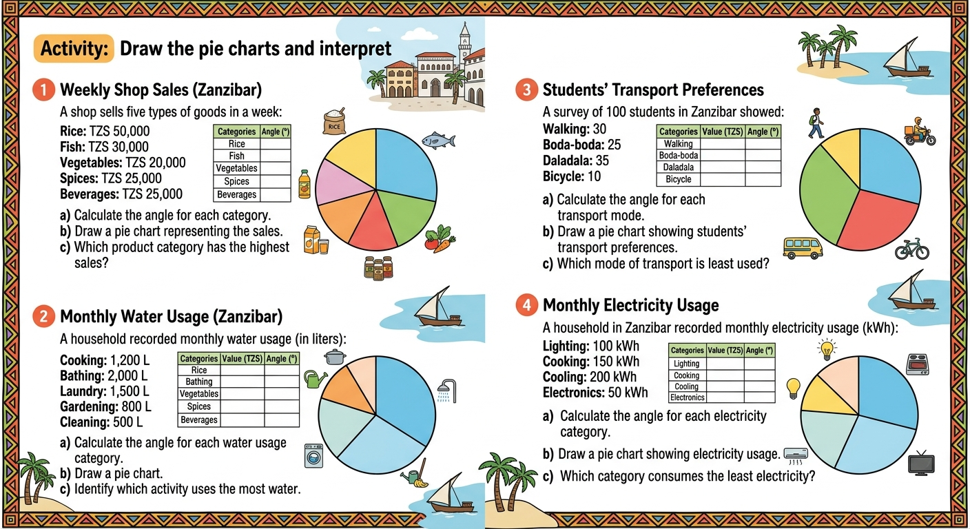
Interpret and solve word problems involving pie chart
Exercise 7
Listening to this topic